Orvis Package Design
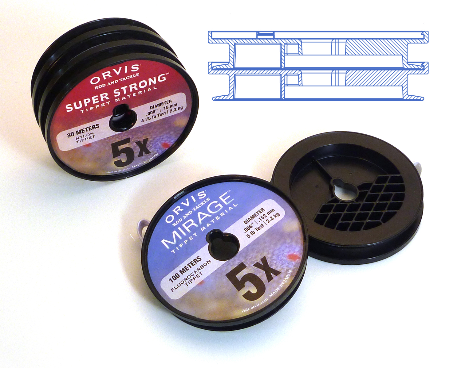
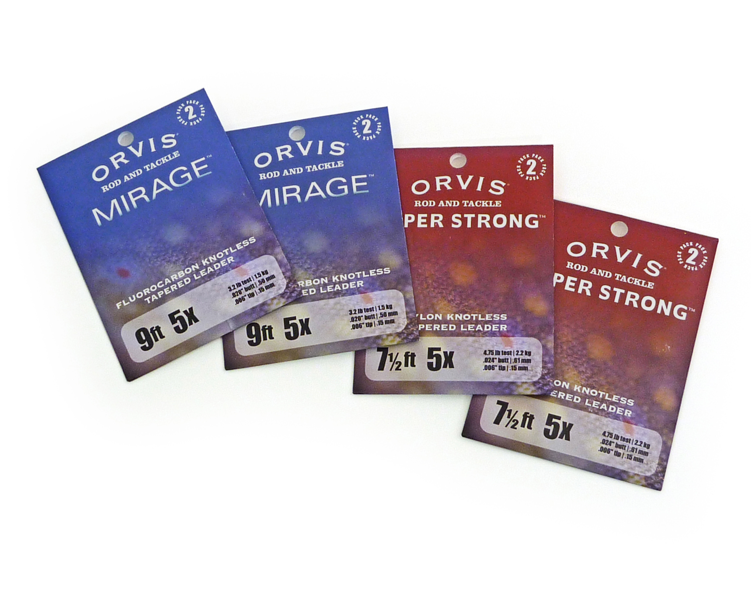
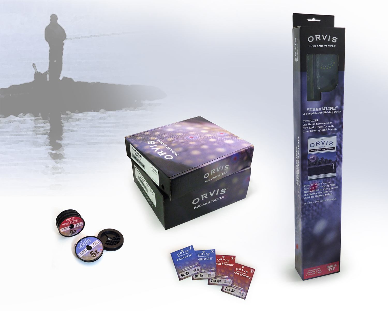
Orvis, the premier name in fly fishing equipment, asked Brownlie Design to develop a new look for their product packaging. It needed to be distinctive, cohesive, and innovative, yet rooted in their corporate DNA. By using a brook trout skin pattern as a background and overlaying established sub-brand word marks, authenticity without sacrificing brand recognition was achieved.
A rounded semi-opaque rectangle was used to group size and style information while reducing visual clutter. Often the products are displayed on a peg board and these elements make for a striking presentation when seen in a large grouping. Specific package types also presented opportunities for structural and mechanical detail innovations. The fly line plastic spool was replaced with paper pulp which is recyclable and biodegradable. The tippet spool was developed to gang together in multiples and spin independently but still orient correctly when hung on a peg board. A secondary surface on the back was added for price stickers, keeping the Orvis label clear.