
USER INTERFACE DESIGN
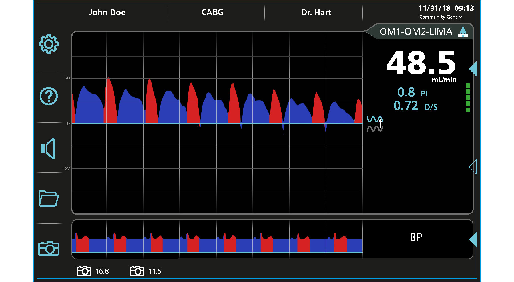
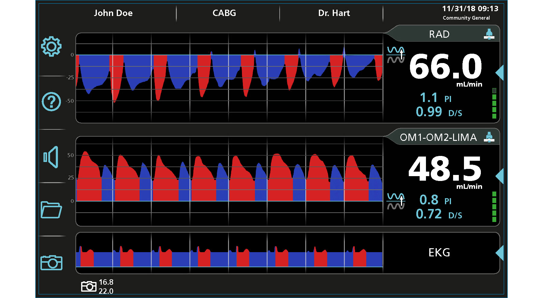
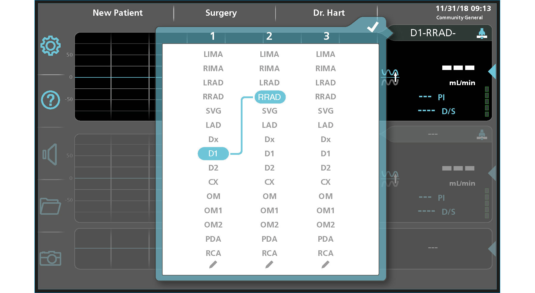
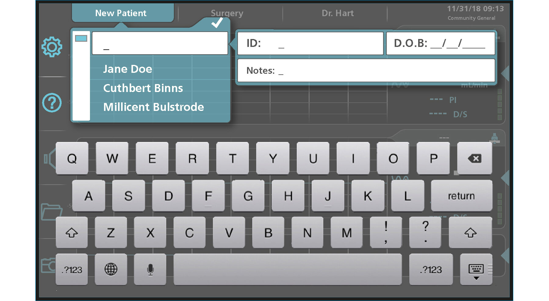
TRANSONIC FLOWMETER
In a parallel effort to the industrial design development of the Transonic Flowmeter and cart, Brownlie Design laid the groundwork for the user interface. The surgeon needed to be able to read critical data from a distance, and the phlebotomist needed to manipulate the display without obstructing the surgeon’s view. We developed icons that would save space, as well as reduce the amount of translation required for non-English speakers. Patient and procedure data entry was simplified with searchable lists and an on-screen keyboard made the product more compact, simpler to update, and easy to clean. Concepts were tested with users, resulting in a solution that was turned over to Transonic’s software developers for production.

CARRIER PROGRAMMABLE THERMOSTAT
Before entering into the market with a Smart Grid–compatible thermostat, Carrier asked Brownlie Design to develop the user interface for the ComfortChoice Touch. Working closely with the Carrier team, Brownlie Design contributed the navigation logic, screen appearance, and icons. Cited by the 2014 Herter Communicating Thermostat Usability Study, the Carrier ComfortChoice was ranked #1 in consumer preference and task efficiency and given an overall grade of A+.
The words “user friendly” and “easy” were used over and over in describing the Carrier ComfortChoice Touch thermostat. . . . Most participants found the Touch exceptionally easy to navigate. One participant summed it up by saying “you know when and what has been set with confidence, no guess work involved.
JLG BOOM LIFT
As a part of the redesign of the JLG boom lift control console, a display was added. Because this is a vehicle that is often rented, the goal was to use the display for start-up instructions and safe operation guidance, as well as for displaying engine status or fault conditions. Using only icons, Brownlie Design developed a step-by-step start sequence. When unsafe conditions occur, the display shows both the warning and the steps to return to a safe position. The same graphic style was then applied to the information screens.


TEC DG 1000
TEC’s digital gauge is part of their system of blower doors and other energy efficiency testing products. By measuring air pressure differences, the gauge calculates the rate of air exchange in a building. Input from these devices comes through tubing connected to the gauge. In placing the tubing below the screen, the displayed data is aligned with the source. Buttons on the screen were positioned so users would have access without obstructing their view of the data or tangling with the tubing during the test. Using the same styling cues, Brownlie Design created the look for a phone app that allowed the test to be monitored remotely.
MICROCHIPS GLUCOSE MONITOR
As a part of the product development of the MicroCHIPS wearable glucose monitor, an intuitive user interface was needed. Connected to a subcutaneous transmitter, the device needed to have a friendly and unintimidating appearance, while still communicating critical information about blood sugar, diet, exercise, and insulin levels to keep the wearer informed and proactive about diabetic monitoring. Navigation was kept simple with a combination of hard and soft keys, and with minimal clicks to get to the needed information.


WELCH ALLYN iCART
In the early days of digital medical records, Welch Allyn asked Brownlie Design to participate in an exploration of a cart design that could carry medical instruments and was also capable of recording and storing vital signs, patient history, and doctor’s notes. As part of this effort, we developed a display with an interface that required minimal text, organized for quick access and interpretation.